


Ranking the NHL's Reverse Retro jerseys
New NHL content to satisfy your hunger for lists in this dry offseason.

Hello friends!
There’s… really not much going on in the hockey sphere currently! The NHL is still deciding on the best route to take as to what to do with the 2020-21 season and when it will begin. While the offseason still has no end in sight, the NHL did release an entire slate of retro jerseys for all 31 teams to wear as alternates next year! And boy, do people have feelings about them.
In typical me fashion, it’s time to rank all 31 jerseys for the Content™️. Let’s dive in!

The NHL had been teasing its Reverse Retro alternate jerseys for some time, as a modern twist on the old school sweaters clubs wore in the past. On Monday, all 31 jerseys that will be worn some time next season were released to the public, and as is often the case with the NHL, it’s a mixed bag!
There are some clear cut winners and losers in this list, and also a whole lot of meh. Much like the other rankings I’ve done, this is my subjective list of jerseys according to the fashion choices I deem aesthetically pleasing. If that’s not your cup of tea, I know there are dozens of rankings for these jerseys out there, so go pick one of those instead!
Now that’s out of the way, it’s time to rank.
31. Chicago Blackhawks

If the league singles out your jersey as the only one they don’t show the front of in their thread (and continue to hide in other official photos), mayhaps your team has a racist logo that needs to be changed! No brownie points here for me, Chicago.
30. Detroit Red Wings

I know the Red Wings have one of the most iconic and unchanged looks in hockey, but come on guys. Boring and uninspired.
29. New York Islanders

There’s no real difference between these and their current jerseys. Hard pass.
28. Vegas Golden Knights

I chalk this low ranking down to the alternate logo of Vegas being so knew, and quite honestly, very meh. I like the stripes, but the primary red logo with the red jersey base doesn’t work for me.
27. Columbus Blue Jackets

These look more like Capitals jerseys than Blue Jackets ones. And not in a good way.
26. San Jose Sharks

I just don’t like the primary gray! A white version of this look would have 100 percent been my choice here, as I like the sleeve design. Just… not a big fan of that gray.
25. Winnipeg Jets

This one is easier on the eyes for me but… I don’t think slate gray was a good choice here either! Also, we were robbed of Atlanta Thrashers throwbacks so this jersey takes a major hit for that as well.
24. Tampa Bay Lightning

Simple jersey design, but I’ve never liked that logo. Would have loved had they gone with the “Bolts” script instead, but alas.
23. Edmonton Oilers
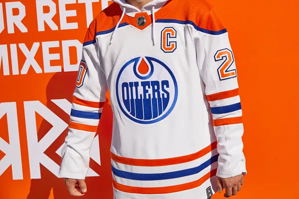
Too many stripes! Makes for a confusing bottom half of the jersey. Top half looks good, and the orange “c” is nice. I do wish the Oilers would go back to the darker blue though.
22. Vancouver Canucks

I understand what Vancouver was trying to do here, but given the franchise has a historic number of looks they could have picked from, this feels like the weakest option they could have picked. I do like the ombre effect between the blue and green though.
21. Washington Capitals
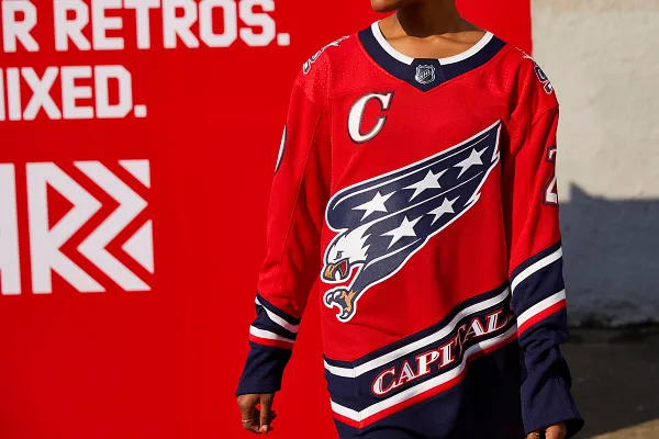
I like the logo and I like that the stripes follow the direction of the eagle. Not sure why I’m not very high on this one though. Maybe there’s too much blue on the bottom?
20. New York Rangers

Great logo! Could have used more white, especially on the collar.
19. Ottawa Senators

Great logo! Could have used more white, especially on the sleeves.
18. Nashville Predators
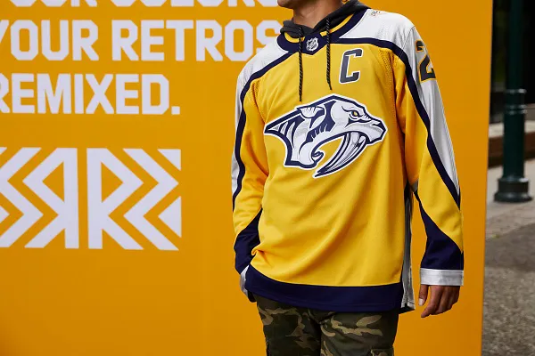
I’d have loved to have seen the Predators rock a navy blue alternate instead of the primary yellow, but this works. Not too much different than jerseys from their past but it’s nice.
17. Philadelphia Flyers

One day, the Flyers will go back to their primary black sweaters. But this isn’t bad in the meantime. I get 90s vibes from the sleeve design at the very least.
16. Florida Panthers

The leaping panther returns! I think the bottom of the sweater is a bit more complicated than it needed to be, but I’m happy to see this logo back.
15. New Jersey Devils
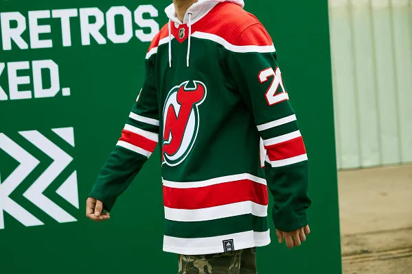
Love me the Christmas tree jerseys, but we’ve seen these before on occasion so I can’t put them any higher. Still crisp though.
14. Buffalo Sabres

I could do without the “Buffalo” scroll on the bottom, but I like the dual sabres. Color balance is quite good here too. Justice for the Buffaslug though.
13. St. Louis Blues

These jerseys are literally just the reverse of their popular sweaters from the mid-1990s. Usually I’m not a big fan of that much red, but I like this look. A classic, but actually reversed.
12. Montreal Canadiens
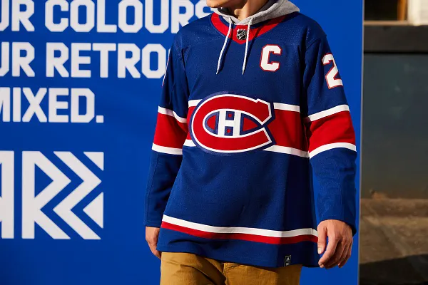
A simple style. Montreal didn’t have to do much to succeed here and it works. You don’t mess with perfection.
11. Toronto Maple Leafs

Same deal as Montreal. A classic, timeless look for another of the NHL’s Original Six franchises. Hard to mess up.
10. Anaheim Ducks


A jersey so ugly that it’s honestly quite beautiful in its own way. Props to Anaheim for not going right to the classic Mighty Ducks look, and instead opting for this. Absolutely the most unique jersey on this list.
9. Minnesota Wild

North Stars colors on a simple Minnesota Wild jersey. The yellow numbers are a really neat touch too. Very clean.
8. Boston Bruins

Honestly, I think these should just become the Bruins’ full time jerseys. We’ve had enough of primary black jerseys unless they’re unique enough to stand on their own.
7. Arizona Coyotes

A classic reimagined for the modern day. I’ve always loved the Coyote head and desert landscape pattern Arizona had back in the day, so it’s great to see them bring this back. The 1990s are here to stay!
6. Dallas Stars

Unpopular opinion: I love these. The negative space for the star on the bottom half is such a great design choice. I’m also a big fan of the mostly white look, even though the stark white border around the lettering detracts from it just a bit. Though when it’s all put together with the all white pants and helmet, it’s a crisp fit.
5. Carolina Hurricanes

I’ll never get tired of the Hartford Whalers throwbacks. It’s such a timeless design, and even though I’m not the biggest fan of the gray, this one works the best out of them all that highlights the hidden “H” in the logo perfectly.
4. Calgary Flames

The Flaming Horse is back!!! We absolutely love to see it, folks. This jersey is basically untouched from their late 1990s look, and we’re better for it. What a logo, and even though it’s an all-black design, this one is a proven winner.
3. Los Angeles Kings
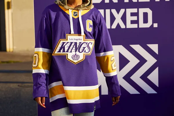
The Kings should have never gone away from their days of purple and yellow, and this jersey is why. A unique color combination that stands the test of time, one which feels right at home with the Lakers in the same building. The NHL needs more out-of-the-box color combos such as this.
2. Pittsburgh Penguins

I hate to admit it, but the Penguins are big winners here. The distraction-free jersey style and the script combined with the simple color combination produce an absolutely beautiful jersey. While I like the Penguins current look, they could replace that with this throwback and I’d have no complaints. Overall, a wonderful jersey.
1. Colorado Avalanche

Colorado just keeps on winning. A Quebec Nordiques jersey in the same colors as the Avalanche? What an absolute flex. Add in the iconic fleur-de-lis as a border on the bottom and you have yourself pure, concentrated perfection. Actual chef’s kiss.
Thank you for reading Patch Notes! If you enjoyed this, share it with your friends and on social media. If you just found this page, take a look at the archive and subscribe if you find something to your liking. Questions, comments, and article ideas can be sent to Mary Clarke on Twitter or at mclarkenhs@gmail.com.